University Marks
Institutional Logo Overview
Northern Arizona University’s logo combines the bold strength of the ligature/acronym* with the sophistication of the wordmark to identify our institution in a clear and emphatic way.
* the precise term is “initialism”
Institutional Logos
Shown on this page with the preferred coloration. See available color variations below.


for limited use when available space will not accommodate the other logos
Logo Anatomy


Primary Institutional Logo
The primary version of the Northern Arizona University institutional logo consists of the university name stacked under the NAU ligature.
To ensure optimal visual impact when using an institutional logo, consider the preferred version as your first choice.
Preferred – Two-Color with True Blue Type
The preferred coloration of the logo consists of “Northern Arizona University” in NAU True Blue (Pantone® 282) and only the mountain graphic in NAU Gold (Pantone® 3514).
For size and spacing requirements, as well as coloration and usage guidelines, see information below.

Secondary Institutional Logos
The goal is to reproduce the institutional logo in ways that deliver the most impact. In cases where available space prohibits use of the primary logo, use the appropriate horizontal version of the institutional logo.
Coloration
In the preferred coloration of the logo, the mountain element is NAU Gold (Pantone® 3514) and the rest of the logo is NAU True Blue (Pantone® 282).
Note: There is a minimum size requirement when reproducing the logos. For size and spacing requirements, see information below.
Two-Line Horizontal
Use when there is not ample vertical space for the primary institutional logo.

One-Line Horizontal
Use when available space is even more horizontal.

Centered
Use only in rare cases where available space does not allow for any of the other logos.

Primary Configuration
This is the preferred configuration of the alternate institutional (brand-level) logo.

Two-Line Horizontal
Use when there is not ample vertical space for the primary institutional logo (see configuration above).
![]()
One-Line Horizontal
Use when available space is even more horizontal.
![]()
Centered
Use in spaces best suited for this configuration.

Wordmarks
See available color variations of these two wordmarks.
Stacked
This version of the Northern Arizona University wordmark is useful in the following situations:
- Imprint area is smaller than 1″ wide or 1″ in diameter.
- Digital web footer, where the institutional logo is presented at the top of the page.
- Part of the return address on a postcard.
Preferred – True Blue
Horizontal
The horizontal version of the Northern Arizona University wordmark is useful in the following situations:
- Height of the imprint area is less than 0.25″.
- Digital web footer, where the institutional logo is presented at the top of the page.
Preferred – True Blue
![]()
Ligature
The NAU Ligature may be used as the dominant branding element for materials produced for internal use, or that are distributed to an audience that is already familiar with NAU. When using the Ligature as the dominant branding element, the wordmark should appear in a subordinate position to define the full name of the institution (see example below).
Preferred – Two-color

The fields of color behind the logo represent a background and is not part of the logo.
Alternate Option

Alternate option is entirely True Blue.
Example Application
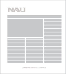
Ancillary Institutional Logo
Institutional Heritage Logo
The institutional heritage logo should be used exclusively for formal communications that are designed to convey institutional prestige.
Size
To ensure the legibility of this logo, the minimum acceptable size is 1.5″ wide (as shown).
Preferred – Two-Color with True Blue Type
Color Variation
Color options for this logo are the same as those shown for institutional logos. The color of the “FOUNDED 1899” should always be blue (except in the black version).
True Blue
Unit Logos
A unit logo can only be issued to an NAU unit, for example the Veteran Success Center, Centennial Forest, or University Events. It cannot be issued to a group of people.
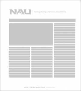
All unit (college, campus, division, and non-academic department) logos should be created using the official logo templates, considering the following criteria:
- The line breaks should appear visually balanced and the unit name should read in a logical way.
- The width of the unit name should not extend beyond the width of the logo and the rule.
- The type size, leading, and position of the unit name should not be altered.
See coloration guidelines here.
Primary

Secondary Horizontal
The horizontal version should only be used when the primary logo doesn’t fit in the available space.
Ligature
The ligature unit logo may be used as displayed below as the dominant branding element for materials produced for internal use, or that are to be distributed to an audience that is already familiar with NAU. When using a location-specific logo as the dominant branding element, the wordmark should appear in a subordinate position to define the full name of the institution (see example below).

Official University Seal
The university seal should never be substituted for the Northern Arizona University logo.
Use of the Northern Arizona University seal is limited to official administrative offices:
- Office of the President
- Arizona Board of Regents–sponsored applications
Use of the seal is limited to official university documents:
- diplomas
- certificates
- documents at the discretion of the university president
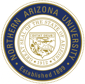
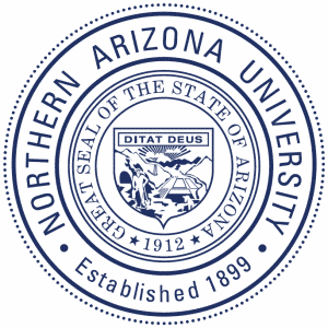
Contact University Marketing to inquire if your proposed use of the seal is acceptable.
Specifications
Maximum size: 3.5″ in diameter
Minimum size: 1.75″ in diameter
Institutional Logo Color Variations
Positive Color Variations
These are the only acceptable color variations to be used over light backgrounds. See here for guidance on using logos over dark backgrounds. These guidelines also apply to the horizontal and centered versions of the logo. The fields of color behind the logos represent a background and are not part of the logo.
Preferred – Two-Color with True Blue Type
When feasible, use the preferred coloration of the logo, where the mountain element is NAU Gold (Pantone® 3514) and the rest of the logo is NAU True Blue (Pantone® 282). This is the recommended coloration for use on the web, on stationery, when the logo is used in a small space, and for most other applications.
Use it over a background color or photo only when there is sufficient contrast to ensure legibility of the logo.

True Blue
For limited use, such as on certain merchandise items, and when the logo is used on an NAU Gold background.
Institutional Logo Color Variations – Reversed
Reversed Color Variations
These are the only acceptable color variations to be used over dark backgrounds. These guidelines apply to both the horizontal and centered versions of the logo. These may be used both on the web and in print.
Reversed Gold
For use over an NAU True Blue background or other dark colors that provide enough contrast for all elements of the logo to be legible and where the colors do not vibrate against each other. Also, for use over a very simple, dark portion of a photo that meets the aforementioned criteria.
The fields of color behind the logos represent a background and are not part of the logo.
Reversed White
For limited use on one-color print jobs such as merchandise or on backgrounds that do not provide enough contrast with, or vibrate against, the gold mountain.
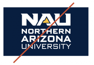
Do Not Use
Do not use the gold mountain when nothing else in the logo is in gold.
This rule applies to all the NAU reversed logos.
Wordmark Color Variations
Positive Color Variations
These are the only acceptable color variations to be used over light backgrounds. These guidelines apply to both the horizontal and centered versions of the wordmark. The fields of color behind the wordmarks represent a background and are not part of the wordmark. (Guidelines for using wordmarks are here.)
Preferred – One-Color True Blue
The one-color NAU True Blue version of the wordmark is for use on a light background.

![]()
Reversed Color Variations
These are the only acceptable color variations to be used over dark backgrounds.
Preferred – Reversed Gold
For use over an NAU True Blue background or other dark colors that provide enough contrast for all elements of the wordmark to be legible and where the colors do not vibrate against each other.
The fields of color behind the wordmarks represent a background and are not part of the logo.

Reversed White
For use over dark colors that do not provide legibility with, or that vibrate against, the reversed gold version of the wordmark. The background must provide enough contrast for the wordmark to be legible and pass ADA accessibility standards.
Unit Logo Color Variations
These are the only acceptable color variations for the unit logos. These guidelines apply to both the horizontal and centered versions of the logo as well.
Positive Color Variations
These are the only acceptable color variations to be used over light backgrounds. (Guidelines for using unit logos are here.)
Preferred — Two-Color with True Blue Type
This is the primary coloration for unit logos.
True Blue
For use at a small size, where the background color lacks contrast with the gold mountain graphic, or where the colors vibrate against each other. Also, for one-color logos used on gold merchandise.
Reversed Color Variations
For use over NAU True Blue or other dark colors as long as they provide enough contrast for all elements of the logo to be legible and pass ADA accessibility standards. On the web, consider using the institutional logo and treating the unit name as a headline.
The fields of color behind the logos represent a background and are not part of the logo.
Reversed White
For use over NAU True Blue or other dark colors as long as they provide enough contrast for all elements of the logo to be legible and pass ADA accessibility standards.
Reversed White
For limited use on one-color print jobs such as merchandise or on backgrounds that do not provide enough contrast with, or vibrate against, the gold mountain.
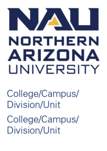
Logo Treatment for Multiple Unit Listing
When multiple units are to be listed on the same piece, use either the Primary or Two-Line Horizontal institutional logo followed by a listing of the units. No rule line should be used between the logo and units. Unit names should be listed in alphabetical order, and displayed in Univers Light in NAU True Blue.
All multiple unit (college, campus, division, and non-academic department) logos should be created using the official logo templates, considering the following criteria:
- The line breaks should appear visually balanced and the unit name should read in a logical way.
- The width of the unit name should not extend beyond the width of the logo.
- The type size, leading, and position of the unit name should not be altered.
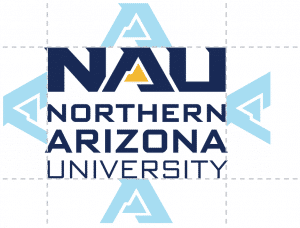
Clear Space
A specific minimum amount of clear space should be maintained around the logo (as shown below) and between the logo and any other elements, including any text, graphic, image, or the edge of a page. Large-format applications (such as pole banners and billboards) may require less space and should be addressed case by case. Contact University Marketing at marketing@nau.edu for guidance.



Size Restrictions
Institutional Logos
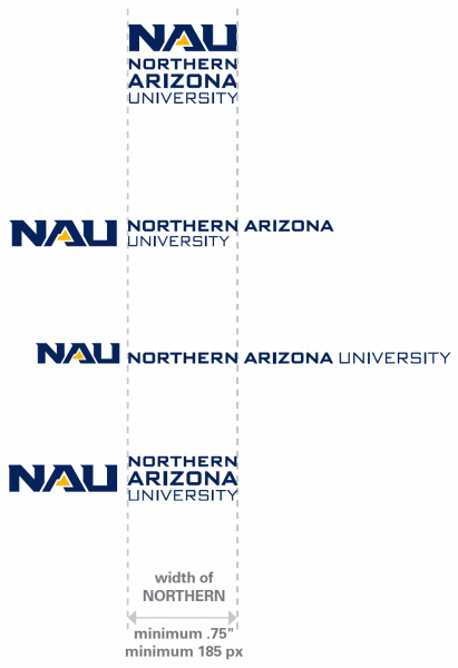
The Northern Arizona University logo should be reproduced at a reasonable size to maintain legibility and clarity. Below are the minimum sizes required for the institutional logos except when used as a social media profile image or an avatar.
Preferred and All Other Colorations
(Except Two-Color with Gold Type)
Unit Logos and Wordmarks
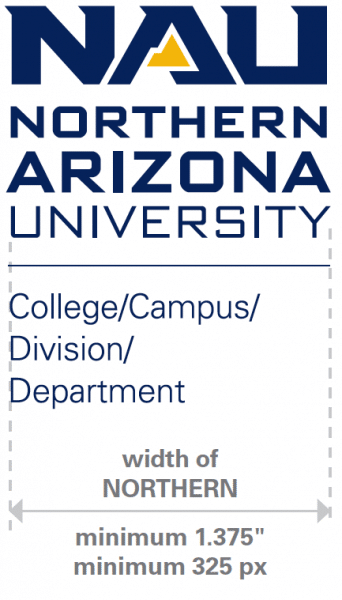
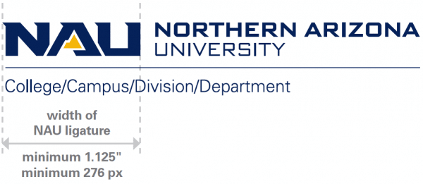
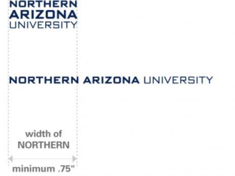
The Northern Arizona University wordmarks and unit logos should be reproduced at a reasonable size to maintain legibility and clarity. Below are the minimum sizes required.
Unit Logos – Primary
Unit Logos – Secondary Horizontal
Wordmarks
One-Color True Blue (and any coloration except Two-Color with Gold Type).
Cross-Branding
The NAU logo can only appear with the logo of another entity when there is an official partnership between the entities. The NAU logo should always be placed on the left or in the most dominant position of the layout in relation to the partner logo, following the specifications illustrated below.
Logo Color, Position, and Size Requirements
- Use the primary configuration of the NAU logo, two-color with NAU True Blue type.
- Follow the NAU clear space guidelines shown here to place a partner’s logo next to NAU’s.
- The university partner’s logo should not dominate the overall look and feel of the NAU logo.
- The text in the partner’s logo should not be larger than the NAU wordmark.

Cross-Branding on NAU Stationery
-
Business card: an NAU partner’s logo may be placed on the back of the university business card. A request for this layout exception needs to be submitted through Printing Services’ online ordering system (nau.edu/order), in order to be reviewed and approved by University Marketing.
-
Letterhead: a partner’s logo may be placed in the bottom right corner of the NAU letterhead, following the same size requirements indicated at left.
-
Envelope: a partner’s logo may not be placed on an NAU envelope.
Sponsored NAU Event/Project
For NAU events, projects, or situations that need to feature external entities as sponsors, the piece should present a strong NAU brand identity. The NAU logo should appear in the most prominent position, with the sponsor’s logo as a subordinate element at the end, preceded by a phrase indicating sponsorship (i.e. Sponsored by…).
Logo Usage and Placement
- The NAU logo should be presented in the most prominent position.
- Follow all preceding guidelines regarding university mark usage.
- For general NAU events and projects the institutional logo should be used. For events and projects hosted by specific units within the university, the unit logo should be used.
- The sponsor’s logo should not dominate the overall look and feel of the document.
- The sponsor’s logo should be preceded by a statement indicating relationship to event, such as “Sponsored by.”
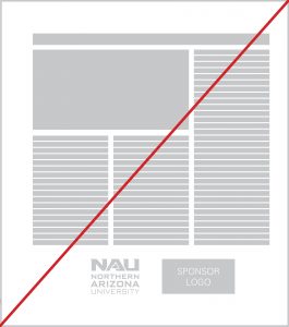
Do not place the logos next to one another.
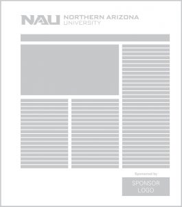
Always place NAU logo at the top and dominant in size, with the sponsor logo towards the bottom and subordinate to the NAU logo.
What file type should I use?
EPS: Encapsulated PostScript files (.eps) are vector files that can be scaled infinitely without the loss of quality. EPS files should be used for any project that will be printed.
PNG: Portable Network Graphic files (.png) is a bitmap file that will only reproduce well at 100% of actual file size, and is resolution-dependent.
All PNG files saved on Widen are saved at web resolution and intended for online use only. Use an EPS file if the logo file being used is intended for a print publication.
Social Media Identity
Depending on the university unit a social media account represents and its main audience, choose from the following options for social media avatars and display icons sparingly.
- To communicate with prospective audiences, always use the institutional logo to reinforce the university’s visual identity. The stacked primary logo is required for any prospective audience-facing accounts.
The gold type stacked logo may be used only for NAU Social accounts and all the university-level accounts.
- Use the stand-alone ligature graphic only when “Northern Arizona University” is spelled out as the account name and is displayed nearby.
NAU Social Media icons, white ligature on Blue background 

- For an NAU department to communicate with internal audiences, such as current students, faculty, and staff, the following options may be used:


Unacceptable Logo Treatments
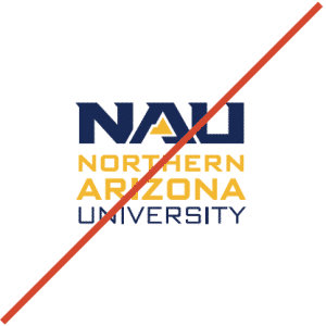
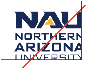
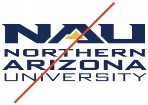
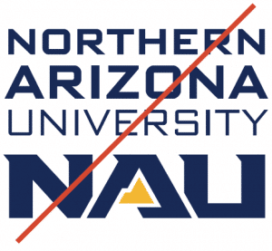
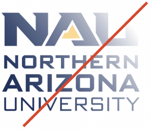
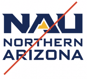
The Northern Arizona University logos may not be altered. The following examples demonstrate logos that are NOT in compliance with the university’s Brand Identity Guide. These unacceptable logos should not be used in any applications.
Unacceptable Logo Color Treatments
The color treatments of the Northern Arizona University logos may not be altered. Only the official color treatments can be used. Always choose the color that ensures the maximum legibility against the background.
Use a two-color positive logo over a background where there is not enough contrast for all elements of the logo to be legible and where the colors vibrate against each other.
Do not reproduce unit logos in any colors other than those shown in this section. Gold type is not acceptable for unit logos.
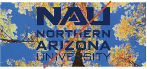
Do not use a logo over a busy portion of a photo. The part of the photo behind the logo must contrast with the logo. (For positive logos it must be light, and for reversed logos it must be dark.)
Louie the Mascot
General Rules
The use of Louie the Mascot by university departments is permitted, as long as:
- it adheres to the guidelines listed above
- it is not altered in any way
- it is not accompanied by any verbiage, text, or design elements
- it adheres to the University Trademark Licensing Policy
Clear Space
In order to remain clean, consistent and prominent, all NAU marks should be surrounded by clear space to determine the minimum distance between the mark and all other graphic elements.
Follow the NAU clear space guidelines shown here to place a graphic element next to the mascot.
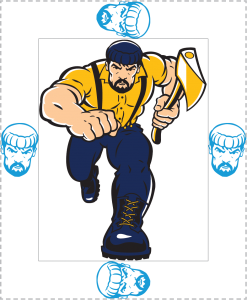
Full color
This is the acceptable presentation of the full-color Louie the Mascot on white and dark backgrounds.


Unacceptable Louie Mark Treatments
The Louie mark may not be altered. This includes replacing the axe with other elements such as a flag, fishing pole, etc. The following examples demonstrate marks that are NOT in compliance with the university’s Brand Identity Guide. These unacceptable marks should not be used in any applications.
While only the full-body mark is shown here, these rules apply to all the Louie marks.
