Applications
Powerpoint Slides
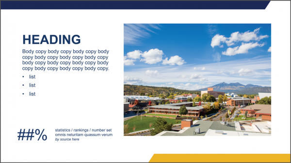
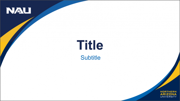
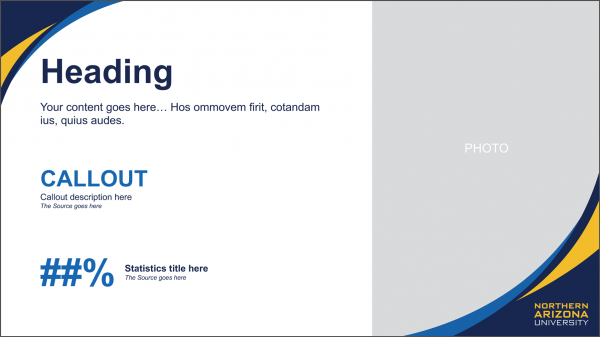
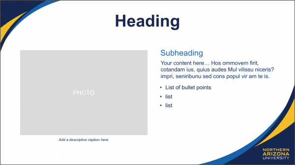
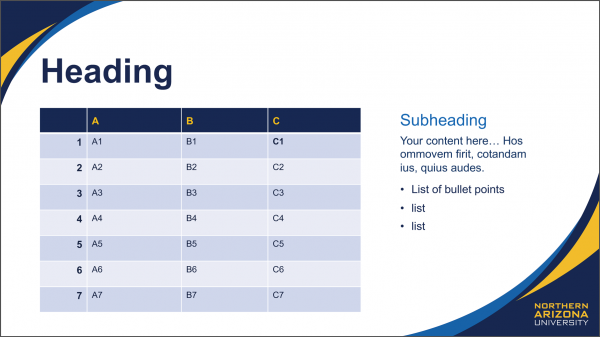
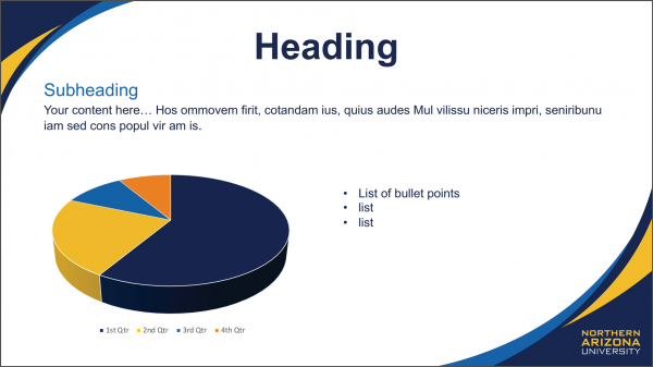
Use the following Microsoft PowerPoint templates for all institution and unit communications. Templates are available at 4:3 and 16:9 ratios for download here.
Sample 1

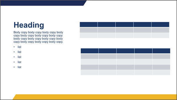
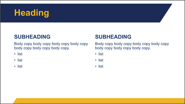
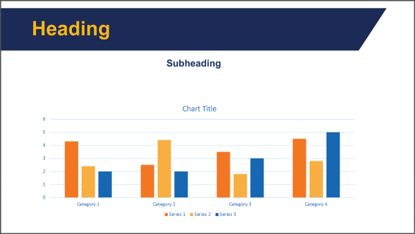
Sample 2
Name Tags – Standard
Standard Engraved Name Tags
Size:
3.5″ x 1.75″
Typography:
Name:
Pantone® 282
Univers 55 Roman, 18 pt
Title:
Pantone® 282
Univers 55 Roman, 12 pt
Unit Name:
Pantone® 282
Univers 55 Roman, 10 pt
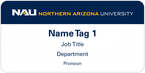
Note: Engraved name tag is not shown at 100%.
Micro-Perforated Name Tags
For temporary or event-based use.
Size: 4″ x 3″
Typography:
Name:
Pantone® 282
Univers 65 Bold, 21 pt
Title and Unit Name: Pantone® 282
Univers 45 Light, 15 pt
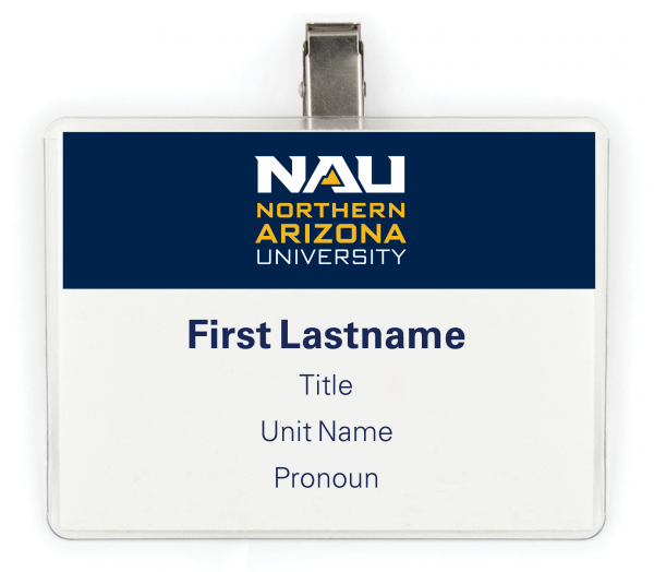
Note: Micro-perforated name tag is not shown at 100%.
Nametags – Event Use
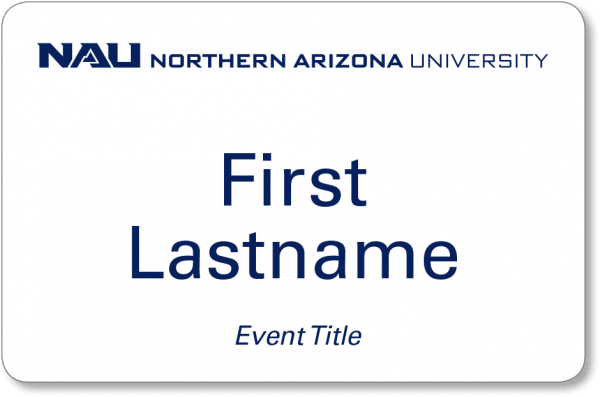
The following pre-printed, adhesive paper name tags (4″x 2.5″) are available for event use. Pre-formatted forms allow for the imprinting of names on an as-needed basis. Event title may be added at the bottom of the name tags.
To order, go to Printing Services’ storefront.
Version A
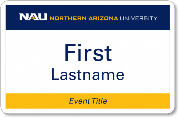
Version B
Signage – Exterior
The following exterior building and wayfinding signs follow a layout system that maximizes the existing signage superstructure. The layout provides excellent legibility for both the identity and the text. Univers 65 Bold is used for all typography on the signs. Building signage does not follow the standard unit logo guidelines in order to maintain the visual priority of the school, college, or building.
The ponderosa pine lines are used as a background device tying the identity to the entity named.
Signage Typography
Univers 65, 0 tracking
Leading for large building sign: 1/1.55 ratio
of physical cap height to next baseline
Leading for pedestrian navigation sign: 1/1.75 ratio of physical cap height to next baseline
Signage Color
Pantone® 282
Pantone® 300

Signage – Interior
-
- For on-campus interior signage, the primary unit logo (shown below) should be used whenever space allows.
Primary Unit Logo
In cases where only a single color is available, the True Blue versions may be used.
-
- For limited vertical signage space, the horizontal unit logo may be used.
Horizontal Unit Logo

-
- For extremely limited signage space, a unit may choose to use only the unit name text instead of a logo. Univers 65 Bold (Pantone® 281) should be applied to the text. This text layout should only be created by the NAU Sign Shop.
Sample Text Layout
![]()
Merchandising
Merchandising – Unit Level
The university’s Trademark Licensing Program protects and promotes the indicia (name, logos, graphics, marks, etc.) owned by Northern Arizona University. Individuals, groups, campus units, and organizations, both on and off campus, seeking to use Northern Arizona University indicia must:
- use a licensed vendor;
- have prior permission from NAU’s chief marketing of officer for using the university’s purchasing card for any merchandise order—visit nau.edu/marketing for more information about this process;
- receive artwork approval from the university trademark licensing manager, which will be coordinated by the licensed vendor before any order moves into production.
For additional merchandising guidelines, please visit University Trademark Licensing at nau.edu/licensing.
-
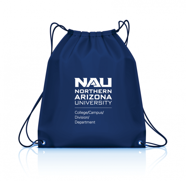
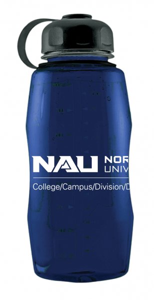
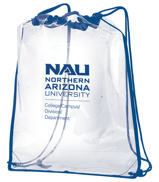
- For unit-level branded merchandise, adhere to all unit-logo guidelines and requirements specified on the brand marks page.
- For a unit-specific merchandise item, the unit’s official logo is required. When imprint space is extremely limited, an alternative logo layout may be used. Consult with University Marketing to develop an acceptable alternative layout.
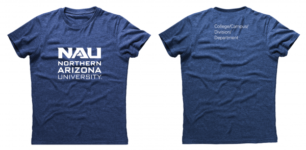
- For clothing items, the institutional logo may be used alone when the unit name is presented elsewhere on the same clothing item, as seen in the sample t-shirt at right.[/column]