Accessibility
Accessibility means that a product or service is available to and usable by as many people as possible. To ensure accessibility, it is best to consider the needs of a wide variety of users at the time that we are designing our product or service, since rebuilding it later will take more time, effort, and resources than doing it well from the beginning.
Digital accessibility
Digital accessibility means that documents, websites, tools, and technologies are created, designed, and developed for all users, including people with disabilities. Assistive technology gives people access to use and interact with the web. This means that all digital content must be accessible.
Why is accessibility necessary?
Digital accessibility greatly benefits everyone and improves the user experience. It not only gives access to digital content for people with disabilities but also helps non-native English speakers, increases audience engagement, minimizes legal risk, and continues to commit to diversity and inclusion efforts.
Commitment to academic excellence
This link leads to the page “NAU – 2025 Elevating Excellence”
What is WCAG 2.1 AA?
The World Wide Web Consortium’s Web Content Accessibility Guidelines (WCAG) version 2.1 AA has “documents that explain how to make web content more accessible to people with disabilities.” A WCAG 2.1 AA Checklist is available from WebAIM for HTML documents. These standards are not limited to websites; they can also be applied to most digital content like web applications, browsers, and other tools.
Accessibility FAQ
How can I learn to make digital content usable for people with disabilities?
NAU’s internal accessibility resources provide information for creating and maintaining inclusive, accessible, and usable documents. The website includes guidelines for creating documents for various learning environments.
What is assistive technology?
The United States Assistive Technology Act defines assistive technology as any product, device, or equipment used to maintain, increase, or improve the functional capabilities of individuals with disabilities.
Assistive technology products include:
- screen magnifiers
- screen readers
- touch screen displays
- speech recognition programs
What is alt text?
Alternative text, or alt text, needs to convey the message you expect to be received by looking at the image.
Reasons to include alt text:
- An image may fail to load.
- Search engines look at alt text.
- Users who are blind or visually impaired need an image’s context and purpose.
When writing alt text, be concise and descriptive, use simple terms and descriptive keywords, and be meaningful.
Alt text do’s and don’ts?
Do
- Describe what is important and use punctuation.
- Be clear and concise.
- Use meaningful language.
- Spell out acronyms (example: N A U or Northern Arizona University).
- Provide alt text on all images and links.
- Include accessible links to a document that provides a detailed description of data for images of tables, charts, and/or graphs.

Correct example alt text: Three students stand outside the University Union near the pedway. While in conversation, two of the students smile. The snowcapped San Francisco Peaks can be seen in the background.
Don’t
- Use single-word alt text.
- Include the words “image” or “picture.”
- Use images of text.

Incorrect example of alt text: An image of three people.
What is reading order?
Reading order is the hierarchy in which content is read. What a person may see visually on screen is not always what someone using assistive technology may hear. Logical reading order helps the user to accurately understand the information conveyed in the document.
What is color contrast?
Checking color contrast
- Check colors in the working document before exporting to PDF. Contrast can be checked in Adobe InDesign, Illustrator, Photoshop, Microsoft Word, or PowerPoint.
- Check your color contrast online with free tools available at TPGi or WebAIM.
Accessible Color Combinations (HEX) Chart
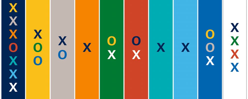
- X indicates that the color combination is approved for both small (minimum 12 px, 9 pt) and large text (e.g., zoomed to 200%).
- O indicates that the color combination is only approved for large text.
Digital accessibility support
Design best practices
Text legibility and readability
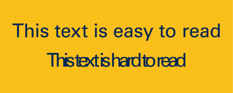
Legibility: Can you see the letters?
Readability: Can you read the words?
Minimum text size for web
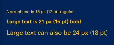
Main body text should be no smaller than 16 px.
Users must be able to resize all text to at least 200% of its original size.
Color Contrast
Good contrast
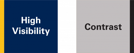
Regular visibility: NAU True Blue foreground and NAU Gold background
High visibility: white foreground and NAU True Blue background
Bad contrast
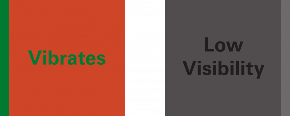
Low visibility: NAU True Blue foreground and Summer Shade Green background
Vibrates: Summer Shade Green foreground and Red Rock Orange background
Accessible Data Visualization
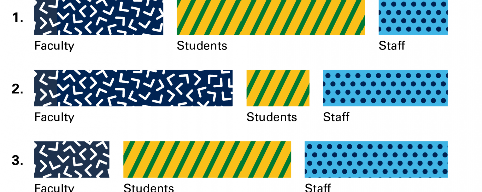
Chart or bar graph recommendations: Use divider lines between data, direct labeling, textures, and/or patterns. Never rely on color alone to separate information. Use various shapes instead of repeating dots.
Logo use on images
Do

Add the reverse (white) logo to dark backgrounds. Be aware of minimum clear space between the logo and other elements including the edges of an image.
Don’t

Don’t add the NAU True Blue logo to dark or busy backgrounds. For positive logos, the background must be light, and for reversed logos, the background must be dark.
Request support through Marketing for external marketing purposes. For NAU internal audiences, please contact the Usable Materials Center. Questions? Contact Marketing at marketing@nau.edu.
