
 928-523-1741
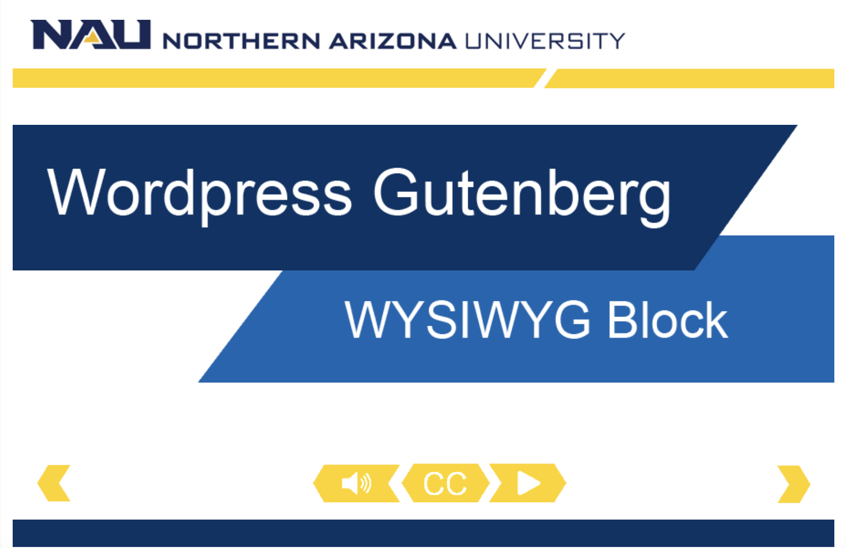
WYSIWYG block
When to use this block
WYSIWYG, an acronym for What You See Is What You Get, is a block that contains a system that allows editors to see the content as it appears on the page. It includes features like bold, italics, bulleted lists, and more.
Use this block when you have content that has a heading, image, paragraph text, and one-three links.
Example of this block

This block is an example of the Headline, Image, WYSIWYG Grouping block.
You can add up to three buttons on this block. The button color display can be ghost, primary blue, or primary gold as seen below.
Video tutorial
In this video, we will be examining how to effectively use the WYSIWYG block in the NAU theme.
Watch the video tutorial: Headline, Images, WYSIWYG block
Self guided tutorial
Let’s add the block to our page by clicking the black box with a plus sign and searching wysiwyg in the search bar. Select the “Headline, image, wysiwyg grouping” block.
Color scheme
The first option you will have is to choose the color scheme you would like the block to be: blue or green.
Eyebrow and headline
The next options you may customize are the block’s eyebrow text and violator headlie.
An eyebrow text is a descriptive keyword or phrase placed above the main headline and blurb, and the violator headline is a headline that displays atop the bottom left corner of the block’s image.
Image
Next, add an image that appropriately captures the essence of your block.
Sentence or paragraph content
As for the content in this block, you will have the option to utilize a two-column format. Take note that the two columns will only appear parallel on desktop screen sizes, and will be stacked on top of each other on mobile and tablets.
The second column is optional, and will not be displayed if left blank.
Buttons
You also have the option to insert buttons into this block by selecting the “Add Row” button. Insert your button’s label, the link, and which type of button you would like to use. You have the ability to add up to 3 buttons.
Finally, you can change how much space is below the block by checking or keeping the box unchecked under “Spacing.” An unchecked box will add 40 pixels of space, so a checkbox will reduce the space between this block and the next block.
Here is the space for the HTML anchor if your Left-Hand Navigation uses the manual link type.
Let’s save our work and preview our edits.
Our block looks great and it ready to submit to the Oasis Workflow!